Tuesday, April 28, 2020

Kent State on NPR


Interview with yours truly on the Kent State NPR station HERE.

Photo by reporter Jeff St. Clair. I'm standing on Blanket Hill, right at the spot the Guardsmen wheeled as one and opened fire. Fifty or so protestors were at the bottom of the hill. See that lone kid walking in the parking lot there? That's just about where Jeff Miller was standing when an inch-long copper-jacketed bullet tore through his open mouth and blasted out the back of his skull, killing him instantly. 

In that parking lot beyond, 500 students walked innocently past, on their way to and from class. Eight to 10 soldiers fired directly into that lot, emptying their clips. 

One of the shooters' initial excuses for this massacre was that they were "surrounded" and in "fear for our lives." Look at the distance involved here. Would you find that kid in the parking lot a potential threat in any way? There were no protestors on the hill. There were about 100 kids watching from the Taylor Hall terrace on the right, not protesting, just observing the spectacle. The student farthest from the Guard who was hit was in front of that building in the distance, the length of over two football fields away. He was shot through the neck, the bullet miraculously missing both his spine and jugular by a fraction of an inch.


Despite the release of Kent State being delayed until September, thanks to the lockdown, it's still generated some media attention. There's no such thing as bad publicity, of course, but it's frustrating that it's unavailable for anything other than pre-order. Ah well, that's just the hand that's been dealt.

This week, I got a nice write-up in The New Yorker, which hails Kent State as "gut-wrenching.'"

"This spring marks the fiftieth anniversary of the Kent State shootings, an occasion explored in Derf Backderf’s deeply researched and gut-wrenching graphic nonfiction novel, Kent State: Four Dead in Ohio” (forthcoming from Abrams ComicArts). Backderf was ten years old in 1970, growing up outside Kent; the book opens with him riding in the passenger seat of his mother’s car, reading Mad, and then watching Richard Nixon on television. “Kent State” reads, in the beginning, like a very clever college-newspaper comic strip—not unlike early “Doonesbury,” which débuted that same year—featuring the ordinary lives of four undergraduates, Allison Krause, Jeff Miller, Sandy Scheuer, and Bill Schroeder, their roommate problems, their love lives, their stressy phone calls with their parents, and their fury about the war. As the violence intensifies, Backderf’s drawings grow darker and more cinematic: the intimate, moody panels of smart, young, good people, muddling through the inanity and ferocity of American politics yield to black-backed panels of institutional buildings, with the people around them saying completely crazy things, then to explosive splash pages of soldiers, their guns locked and loaded, and, finally, to a two-page spread of those fateful thirteen seconds: “boom!” “bang!” “bang! bang! pow!”


Sunday, April 19, 2020

Kent State to be released Sept. 8!


Finally got the actually release date. KENT STATE was, of course, originally scheduled for an April release, but you know what happened. Abrams has pushed the date to September in the hope that the book retail machine will be back up and operating, even it's only at 50 percent or whatever. That's better than the current state, which is not at all.

You can pre-order the book in the usual places. Links to the left here. 

Friday, April 17, 2020

Lockdown video interview

Talking with Dave Filipi of the Wexner Center at Ohio State University.


Thursday, April 9, 2020

Greetings from the Bunker


I don't know what to write about this nightmare. 


I thought about doing some regular True Stories about living (hopefully) through this, but what is there to write about? Sitting in my studio under lockdown and scrolling through ever-more-gloomy news reports? I leave the house once a week to get food for my family, that's it. Is my search for toilet paper a compelling diary comic? 


I talked about this with a colleague. "There's going to be a LOT of comics about coronavirus," he said. He's right. I see some of them on Twitter already. 


If I have nothing worthwhile to contribute, and nothing has come mind yet, maybe I'll just go in a completely different direction. People need distractions. OK, maybe not right NOW, when it's pandemic 24/7, but eventually, when this thing starts to ease up. If the warnings are true and it's two years before this passes, with recurrent flare ups that send us diving back into our homes, and sends the economy plunging over and over again, then people will REALLY need distractions.

I think back to popular art during the Great Depression. Comics didn't wallow in the suffering and economic misery and the rising tide of fascism around the world, terrifying things we're repeating here in 2020. Readers instead devoured the humor of Popeye and the gentle laughs of Gasoline Alley. They thrilled to daily installments of exotic adventure strips set in far-flung climes, like Terry & the Pirates and Cap'n Easy, or in the mind-bending fantasy of Tarzan, Flash Gordon and Buck Rogers. In 1938, Superman ushered in the superhero and the introduction of comic books. Real-life struggles were seldom depicted.

Of course, comics were different then. They've grown up since.

I dunno. We'll see. Right now, what I'm dealing with is the total loss of my planned book tour, some 40 cons, signings and speaking gigs that took me right up to San Diego Comic Con in July. There's a second leg in the Fall, which is still on, but for which, frankly, I don't have much hope. I spent months planning this tour, and rested up in anticipation of the grueling schedule, which had me criss-crossing the country, as well as a couple jaunts to Europe. It  all vanished in the space of a couple days. The official release date of Kent State was yesterday btw. I glumly noted the date from here, then watched an episode of Shitt's Creek to take my mind off it. Now the release has been pushed back to Sept. 8, as detailed in my earlier post.

So... I'll be getting back to work soon. Might as well get something out of all this unexpected downtime!

I've been experimenting with color these past few weeks, retrofitting pages from Punk Rock & Trailer Parks, as in the page depicting The Baron's debut, above.

None of my long-form comics have been color, of course. Trashed had a spot color. The rest are b&w. The City was b&w for 15 years, too, before I reluctantly added color. Shitty color, since alt-weeklies had infamously bad reproduction. I regret adding color to that strip. It was a lot more work and didn't add anything to the read. Other, smarter creators, never made that switch, like Matt Groening and Lynda Barry. Their strips were b&w to the end, as they originally envisioned, one consistent body of work. Mine is split in two, The City of the 1990s, and then the color one of the 2000s, which was an entirely different strip, really. I should have re-named it. Thought about doing that. I regret not doing so.

But I've worked in full color for years and years, all the way back to my first newspaper gig in South Florida. Posters, record covers, book covers, gig flyers, freelance illustrations, hundreds of images, all were done in color. I prefer very dramatic eye-catching colors, in fact, which always surprises those who only know my work in b&w. Here's some samples.

A very early, unpublished story from 1989. I drew this on scratchboard (!!) and colored it with Dr. Martin's Dyes. Crazy media in which to work. Didn't stick long with that!  The colors aren't really working here. I was shooting for a noir-ish look, but it needed a much stronger black.


This was an illustration for the Detroit Free Press, also from 1989. This is pen&ink over color pencil. Another goofy mixed media. Color pencils are very waxy, so most ink won't stick. The scanners of the day also had big problems picking up the color. I was very happy with the piece, though. In fact, this is the exact moment it all came together for me, stylistically, After several years of frustrating experimentation. I finished this piece and literally yelled, THAT'S IT! The saturated, dramatic color palette became a staple, too. This one pivotal piece carried me through the next decade, and still resonates in my work.


Comp CD cover, 1995. I moved to gouache paint after my earlier failures, and that proved to be a reliable media. Pen & ink took to it beautifully, too. I've never been a great painter, but strong ink line covers many a weakness. There are a lot of European comics creators who still work this way! Their work is gorgeous, but MAN, it's time consuming.


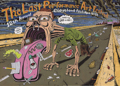
Above: the poster for Int'l Performance Art Festival, from 1999, billed as the final one (although that turned out to not be the case). I drew this huge, poster size, with gouache paints and pen & ink.


Above: album cover for local band Hazard Adams, 2010. Everything from here on is digital color, applied to scanned pen & ink drawings. I miss paint, but not enough to go back.


Above: Klaus Nomi, for the Belgian magazine Focus, 2014.


Above: poster for The Genghis Con, 2016

Above: wraparound album cover for the Essential Styrenes, 2016. There's Magee from Trashed and Otto from Punk Rock & Trailer Parks in the crowd!


Above: the most dramatically colored piece of all is this poster for the Rock en Seine Festival in Paris. This one was printed as a HUGE poster for the Paris Metro! It was an eye-grabber, for sure. No one can accuse me of being shy with color!


More dramatic colors, in a poster showing young Jerry Siegel, the co-creator of Superman, in front of his house in Cleveland, for the Siegel & Shuster Society, 2016.


Above: and finally, another album cover, for pals Chris Butler and the late Ralph Carney. Really crazy colors on this one. 


So moving forward, yeah, I think my books are going to be full color. That's a pretty daunting amount of work, of course, adding color to 200-300 pages of art, and not a job I'll be tackling myself. I'll have to hire a colorist. But the world is in color. I love b&w and the DIY vibe it has, and the moody purity of it, but it's time, past time, to move on.

Here's another test page from PR&TP to whet your appetite: